Apple has given its most direct confirmation yet that a USB-C-equipped iPhone will happen, now that the European
Union is mandating that all phones sold in its member countries use the connector if they have a physical
charger. When asked by The Wall Street Journal’s Joanna Stern if the company would replace Lightning, Apple’s
senior vp of worldwide marketing, Greg Joswiak, answered by saying: “Obviously, we’ll have to comply; we have no
choice.
Stern brought the law up during a talk with Joswiak and software VP Craig Federighi at the WSJ’s Tech Live
conference and followed up by asking when we can expect to see USB-C on an iPhone. Joswiak replied, “the
Europeans are the ones dictating timing for European customers.” Currently, the law dictates that “all mobile
phones and tablets” will have to use USB-C by “autumn 2024.” Joswiak refused to answer whether the company would
include the connector on phones sold outside the EU.
But he made it abundantly clear that Apple isn’t happy about being legally coerced into making the switch. Before
acknowledging that the company must comply with the law, Joswiak went into a long explanation about how Apple
has historically preferred to go its own way and trust its engineers rather than be forced into adopting
hardware standards by lawmakers. He cited the examples of Micro USB and hearing aid compliance as situations
where Apple has been pushed to meet ill-considered requirements.
He also suggested that charging bricks with detachable cables have mostly solved the issue of standardization and
claimed that switching the iPhone from Lightning to USB-C would cause lots of e-waste. (Personally, I don’t find
this argument compelling; I have to replace most of my Lightning cables every few years anyways, at around the
same cadence I buy new phones because they wear out or get chewed on by cats.)
Still, it’s telling what didn’t come up: a portless iPhone that relies solely on wireless charging, something
that would theoretically be allowed. Joswiak didn’t say that the company is weighing its options or mention
discussing ways to avoid putting a USB-C port on the iPhone. Instead, we got a resigned, slightly winding answer
that lead to what seems like an inevitable conclusion: USB-C is the future port for connecting to and charging
your iPhone.
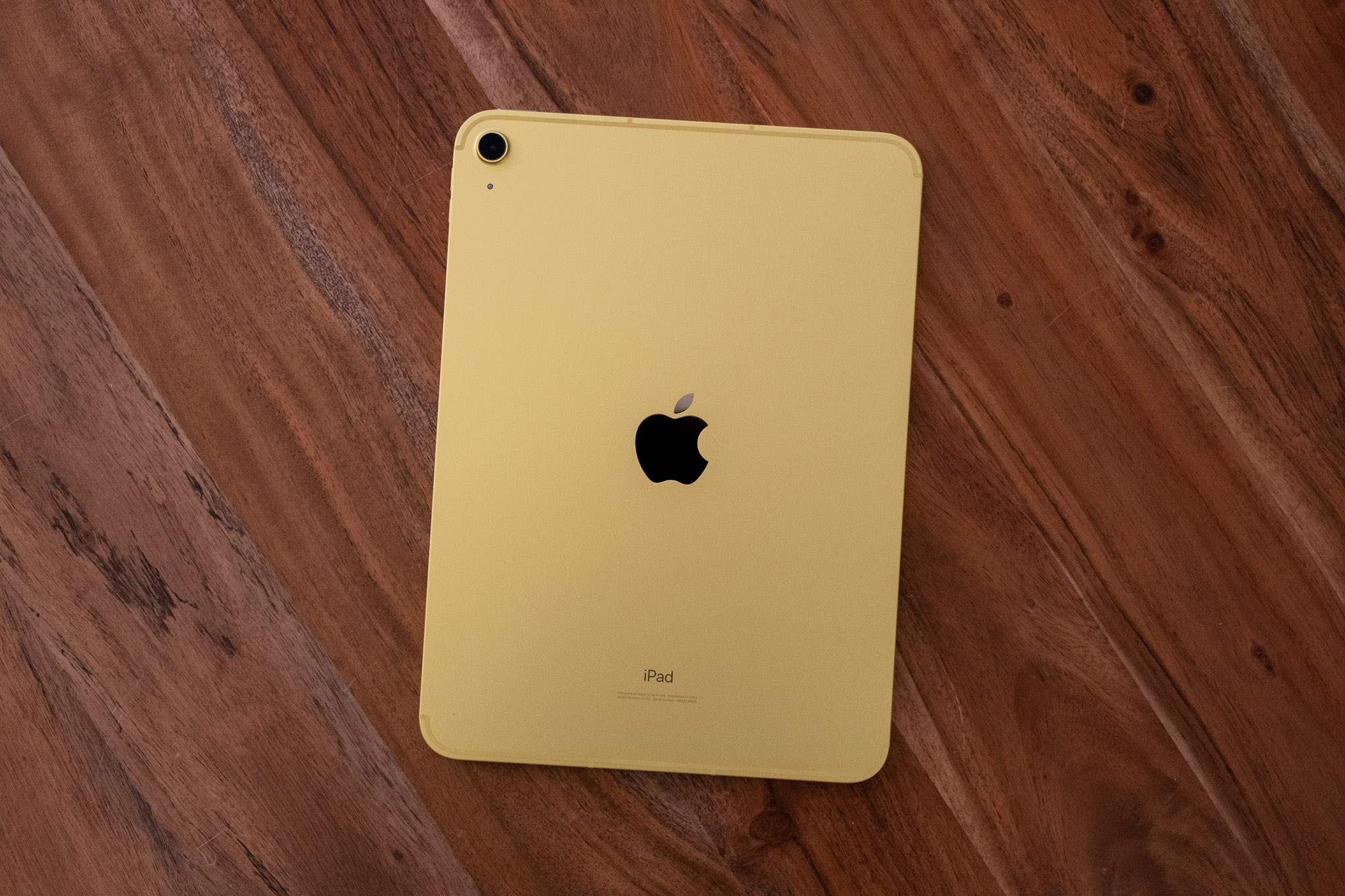
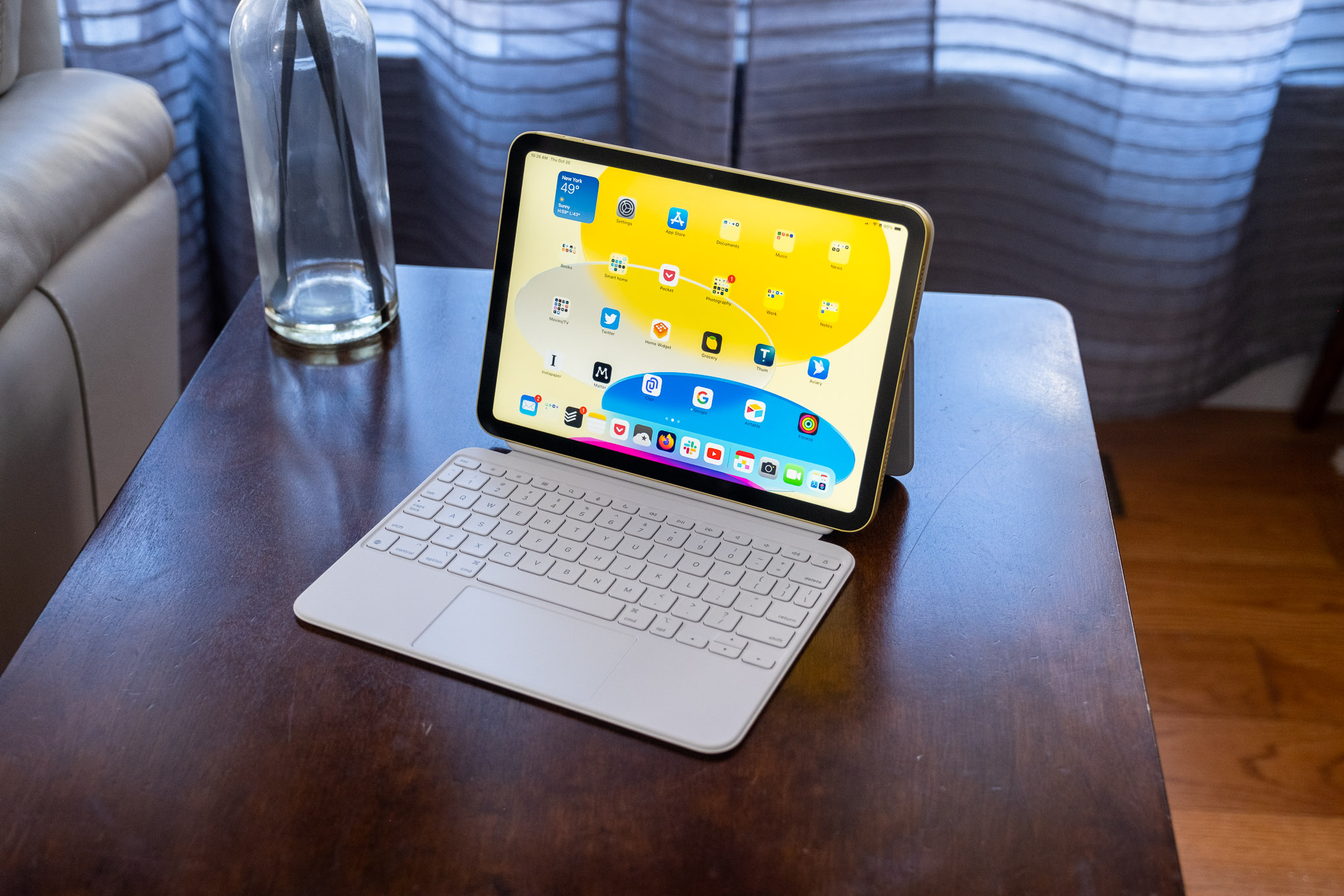
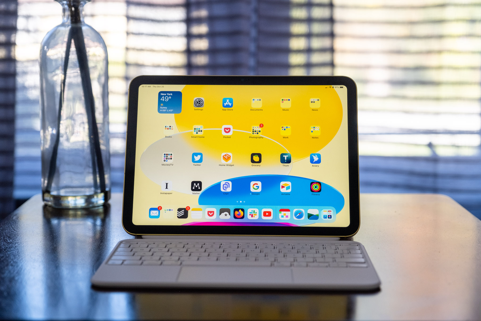
Apple’s latest base-model iPad cribs a lot of features from the more expensive iPad Air. But it also is
considerably more expensive than before, making it a tough sell.
The new 10th-generation iPad is ostensibly the new starting point
for the iPad line. It’s got a bigger screen, faster processor, and better design than the ninth-gen
model that came out in 2021 and has been the entry point for the iPad line for the past few years. The
bigger size screen and many of the design features have trickled down from the more expensive iPad Air, but the 10th-gen iPad has
an older processor and makes some other omissions to bring the price down.
At its core, this iPad is an excellent tablet with fast performance, reliable battery life, and a
vast library of optimized apps to make use of its large touchscreen.
But along with those upgrades comes a higher price: the 10th-gen iPad starts at $449, $120
more than the previous model, and can be kitted out to over $1,000 with storage, cellular, and accessory
upgrades. This is for the entry-level iPad with no qualifier after its name, the one that you buy for
casual use, kids, schoolwork, travel, and content consumption — it’s not really a device to replace your laptop
with.
Apple seems to be aware of this conundrum because it’s still selling the ninth-gen iPad for $329, a much more
palatable and accessible price for the many people just looking for a basic iPad to do basic iPad things.
That puts this iPad in a weird spot — it’s certainly better than the ninth-gen model (which is still
great), but it costs considerably more and is not as good as an iPad Air. And since you can find a current iPad
Air on sale fairly easily at this point, this new iPad is not the iPad to buy right now despite the fact that it
has a lot going for it.
Looking the part
The 10th-gen iPad brings the squared-off, even-bezel, home button-less design
Apple introduced on the iPad Pro way back in 2018 to the sub-$500 price point. It’s very nearly a clone of the
last two iPad Air models, with the same size display and chassis measurements within a millimeter of the Air in
every dimension. (Those millimeters do mean it’s different, though, and precisely fitted cases can’t be swapped
between the Air and the new iPad.)
The updated look is much more modern than the ninth-gen iPad, but since we’ve seen variations of this
for four years now on other iPad models, it doesn’t look particularly fresh. It just looks like an iPad.
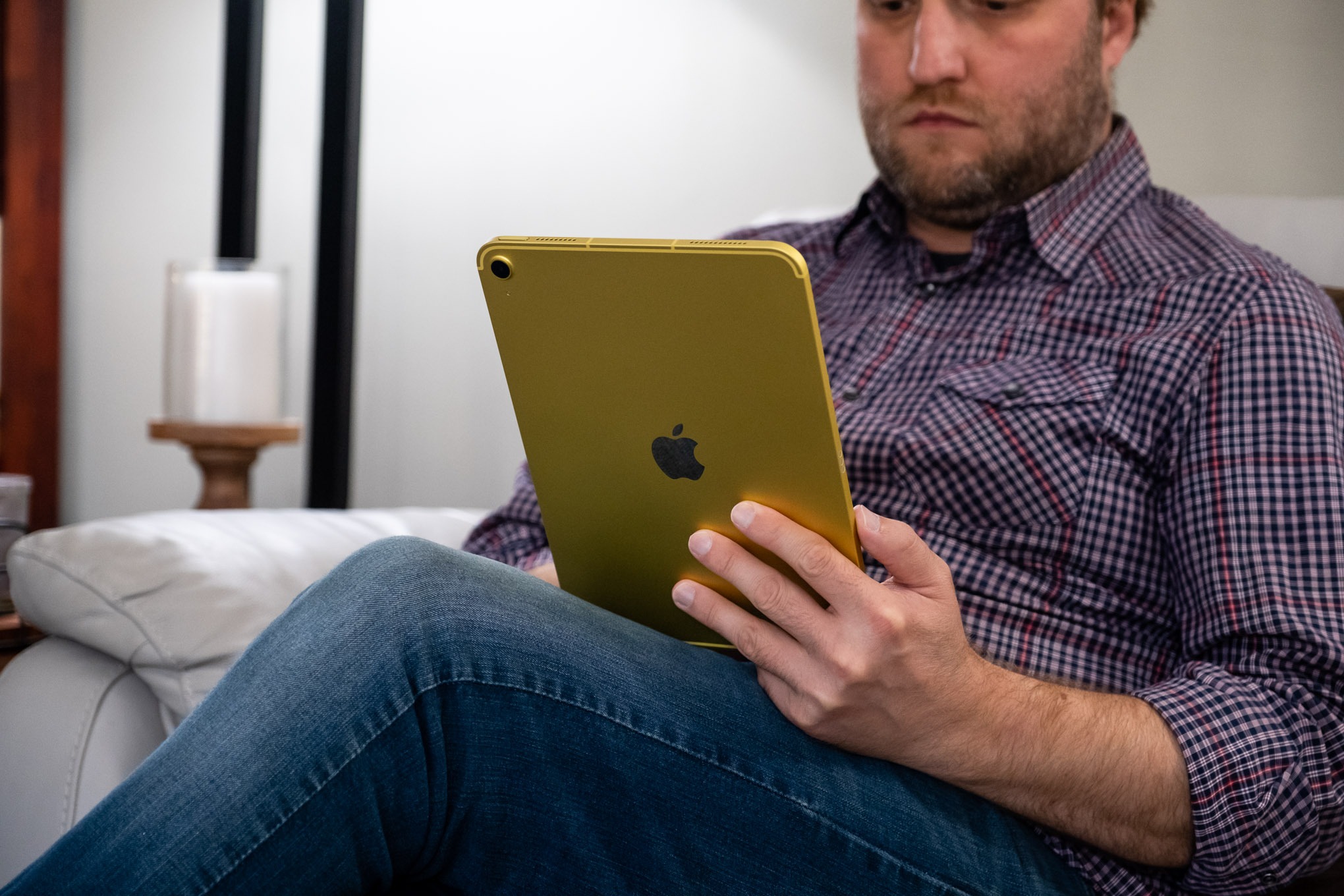
Like virtually every other iPad ever made, the new model has an excellent fit and finish that feels
nice to hold and interact with. My review unit is a yellow that I’m not especially fond of, but thankfully Apple
sells it in three other colors, including silver, blue, and pink.
The 10th-gen iPad is nearly identical in size and shape to the last couple generations of
iPad Air.
Apple says the iPad has an “all-screen design” in its marketing materials, but let’s be honest here:
the front of this new iPad is not “all-screen.” There is a considerable bezel area framing the display, and
though it’s nice that it is the same size all around and provides a place to hold the thing without accidentally
touching the screen, it’s far from edge-to-edge. Plus, there’s a camera on the front. So even if you don’t count
the bezel, it’s not “all-screen.”
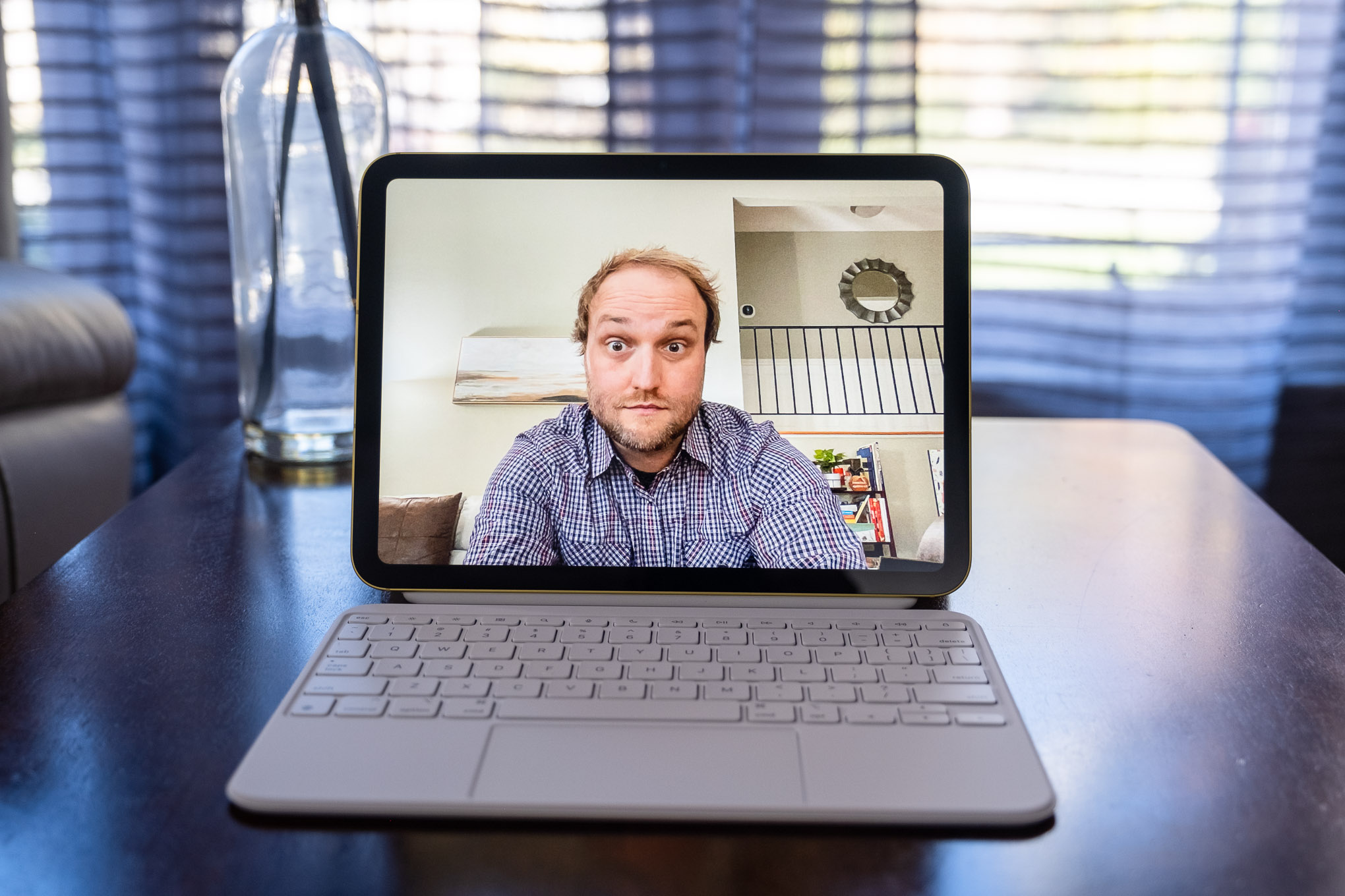
The camera is good news, though: in a long overdue change, Apple’s stuck the front-facing camera in
the bezel on the long edge of the screen, which makes using it for video calls in landscape orientation much
easier. It’s surprising that this is the first iPad to actually have the front camera in the right spot, but
it’s a safe bet we’ll see this change in future updates to other iPad models (though not for this year’s iPad
Pro M2, oddly). The camera itself is just fine, but the better placement makes using it for video calls from a
desk much less awkward. It still supports Apple’s self-centering Center Stage feature, but there’s no real point
to using it now that the camera is in the right spot, and I left it off for the majority of video meetings I
took on the iPad.
Finally, an iPad with the camera on the long side, which is much easier to use for
video calls.
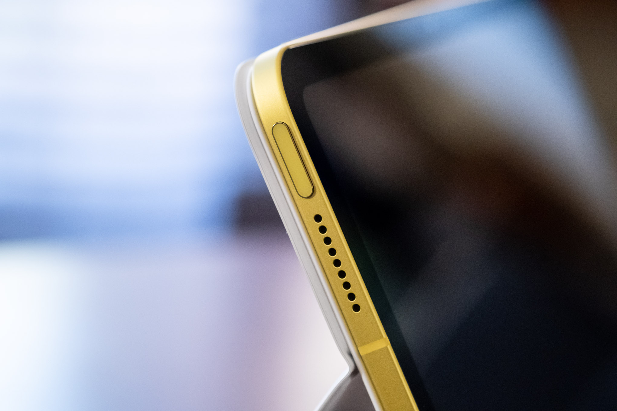
The Touch ID sensor has been moved to the left edge of the 10th-gen iPad since
there’s no longer a home button on the front.
The biggest upgrade over the ninth-gen iPad, other than the updated design, is the larger screen,
which stretches out to 10.9 inches diagonally from 10.2. It’s the same size as the iPad Air’s screen, and it has
the same brightness and resolution. It’s a good size for a tablet and comfortable enough for getting light work
done as well as watching movies, reading, or playing games, even if it feels a bit cramped as a laptop
replacement. The roughly 3:2 aspect ratio also works well in either portrait or landscape orientations.
But unlike the screens on the iPad Air or Pro, this is not a laminated display, and it
has an inferior anti-glare coating to those models. That results in a screen that’s just not as nice to look at,
with more reflections, a noticeable gap between the glass and the LCD panel, and shifts in brightness when you
view it off-axis. These issues are much more forgivable at $329, but it’s a lot tougher to excuse this display
at $449.
Also carried over from the iPad Air and Mini models are the Touch ID fingerprint scanner in the power
button on the left side (when in landscape orientation) and a USB-C port for charging and data in place of the
prior iPad’s Lightning port. The Touch ID scanner works well enough, even if it’s not quite as seamless and
convenient as the iPad Pro’s Face ID system. The USB-C port makes charging and attaching accessories like USB
hubs much more convenient than before, though it is limited to USB 2.0 data speeds and 4K 30Hz (or 1080p 60Hz)
external displays. I don’t think either of those limitations will matter much for the consumer uses this iPad is
meant for.
The big thing that’s missing here is a headphone jack, which is a baffling deletion for the iPad that
is supposed to appeal to the widest range of people. A lot of schools and parents buy entry-level iPads for
kids, and not having a universal and easy way to plug in standard wired headphones will be frustrating. Apple
does include a braided USB-C cable (nice) and a 20W charging brick (bless) in the box, but there’s no USB-C to
3.5mm wired headphone adapter. That’ll cost you $9.
The 10th-gen iPad has the same size 10.9-inch screen as the iPad Air, but it is not
laminated and doesn’t look as nice.
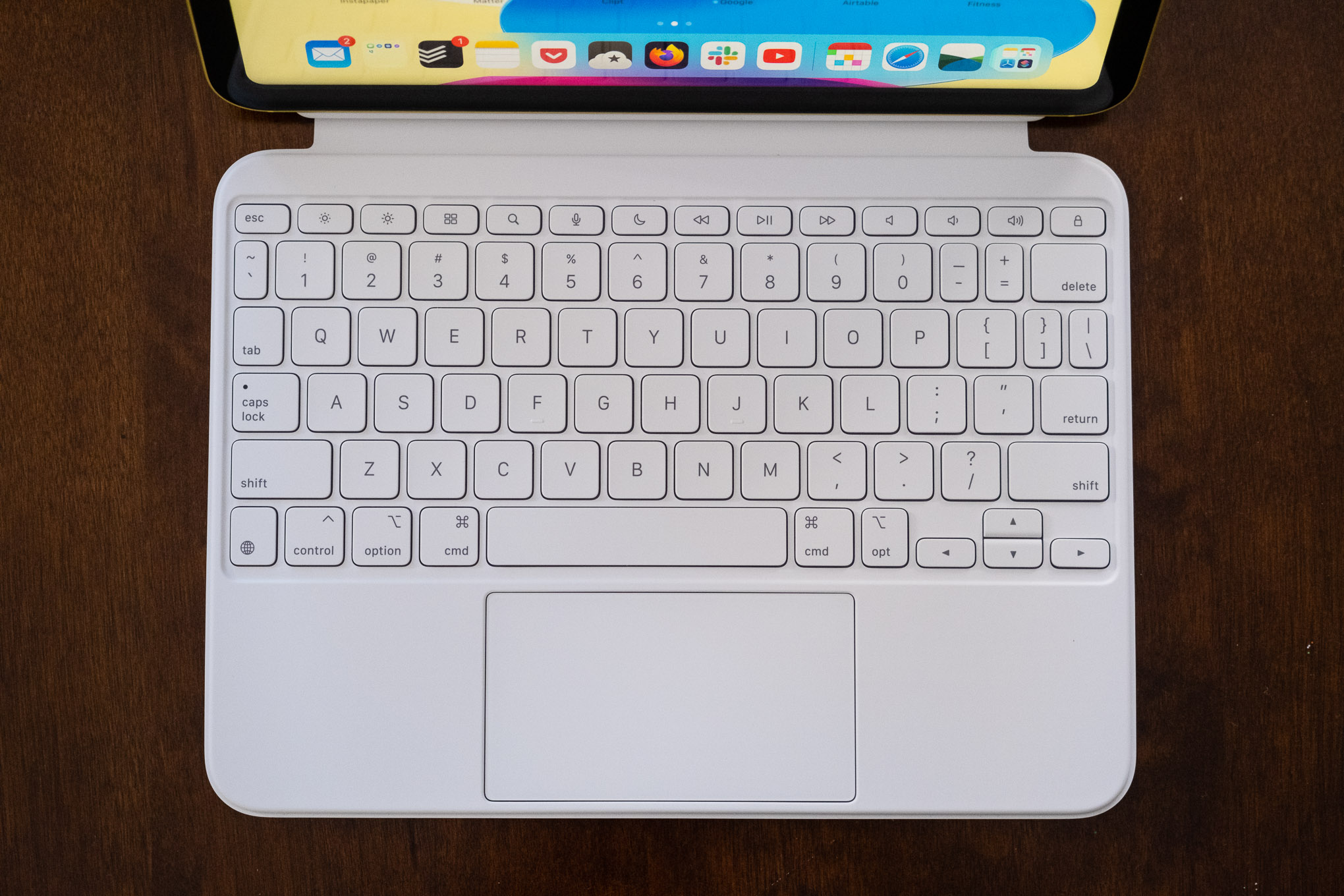
Magic Keyboard Follies
Despite the 10th-gen iPad looking like the iPad Air and iPad Pro
models, it doesn’t share any accessories with them. Instead of using the same Magic Keyboard as the Air and Pro,
the 10th-gen iPad gets a wholly new keyboard accessory called the Magic Keyboard Folio. (If you’re keeping
count, that brings Apple’s iPad keyboard
lineup up to six distinct models, and no, you can’t use this new one with an iPad Air or Pro.)
The Magic Keyboard Folio has a detachable keyboard with comfortably sized keys and an excellent
trackpad. But it lacks a backlight.
The staggeringly expensive $249 Magic Keyboard Folio (a full 55 percent of the iPad’s starting price,
putting an iPad-plus-keyboard kit at $700) has a two-piece magnetic design with a back cover with a kickstand
and a separate keyboard. The keyboard connects to the iPad via the Smart Connector on the tablet’s edge,
eliminating the need for a battery or Bluetooth connection.
Typing on the Folio keyboard is satisfying — the keys have the same amount of travel as Apple’s Magic
Keyboard, and they are well-sized and spaced apart. The trackpad is also excellent and even slightly larger than
the one on the Magic Keyboard. The inclusion of a function row with quick access keys for things like media
control, volume, and brightness, is much appreciated; the lack of any kind of backlighting is a dumb omission,
especially at this price.
Unlike the Magic Keyboard for the iPad Air and Pro, which features a unique floating design, the
Magic Keyboard Folio is a design we’ve seen many times before. It’s very similar to Microsoft’s Surface
keyboards and basically identical to the keyboards that are bundled with inexpensive tablets like Lenovo’s $300
Chromebook Duet. It’s even effectively the same design as the $160 Logitech Combo Touch, which comes in versions
for the iPad Air, Pro, and now the 10th-gen iPad.
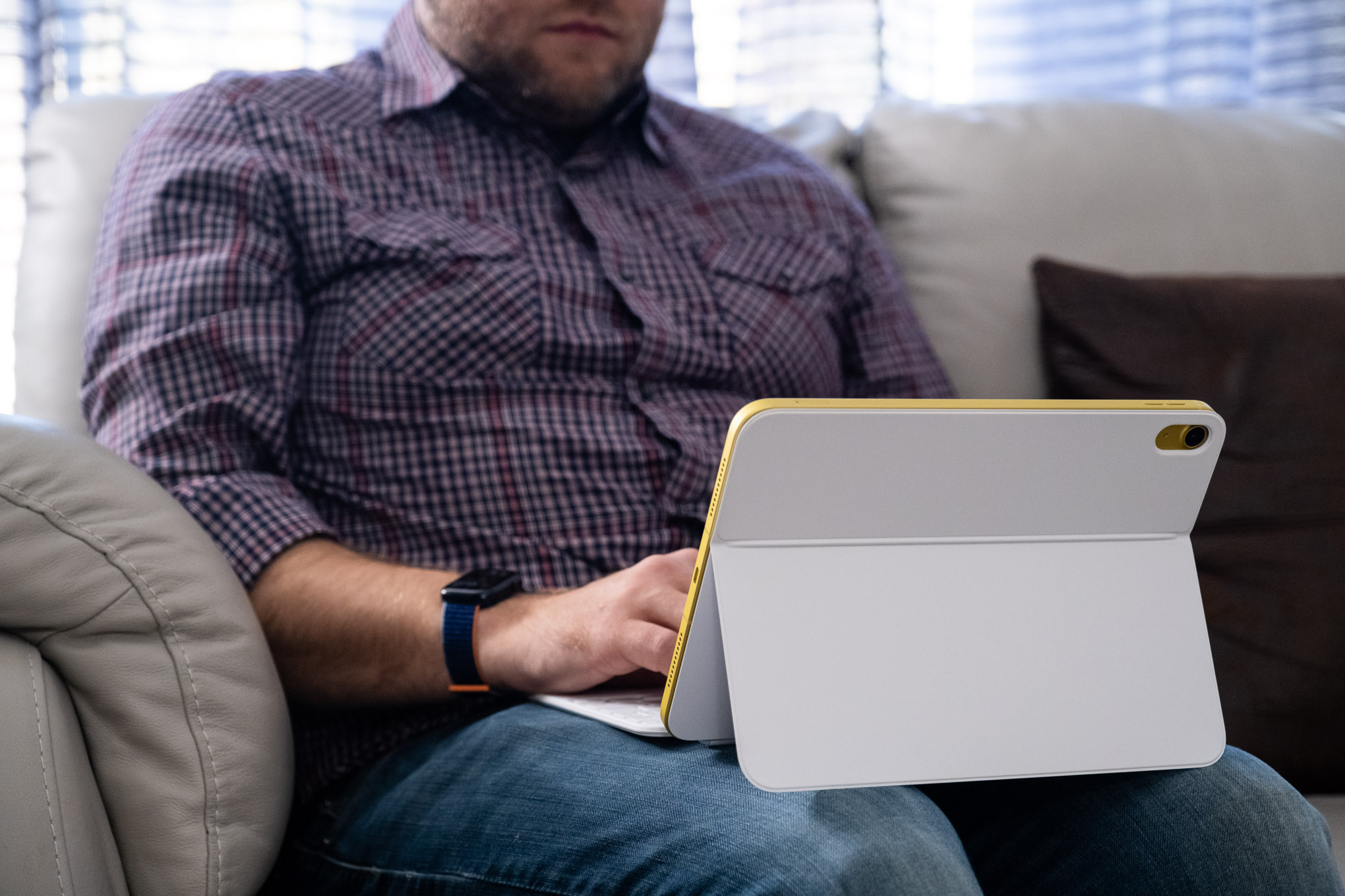
The Magic Keyboard Folio’s design is less stable and more awkward to use on a lap than the
Magic Keyboard for the iPad Pro or Air.
This two-piece design provides more flexibility than the Magic Keyboard — you can pull the keyboard
off and still have a kickstand holding the tablet up for movie watching or gameplay with a controller. But it’s
also much less stable on my lap — I’m able to make it work, but it’s not nearly as comfortable as the Magic
Keyboard or a proper laptop. Microsoft solved this somewhat with more magnets to hold the keyboard in place
better, but Apple’s keyboard is much floppier on a lap. You really have the best experience using this on a desk
or table.
Apple’s design also limits how far back the kickstand can travel, so you can’t push it down to a
20-degree angle ideal for drawing or writing like you can with many other keyboard cases of this type. And just
like the Magic Keyboard, the Magic Keyboard Folio provides virtually no protection against drops — if you need
something with more protection, you should look at Logitech’s offering.
Lastly, the Magic Keyboard Folio only comes in white, so you’ll want to be careful using it while
eating a Doritos Locos Taco unless you want a slightly orange Magic Keyboard Folio.
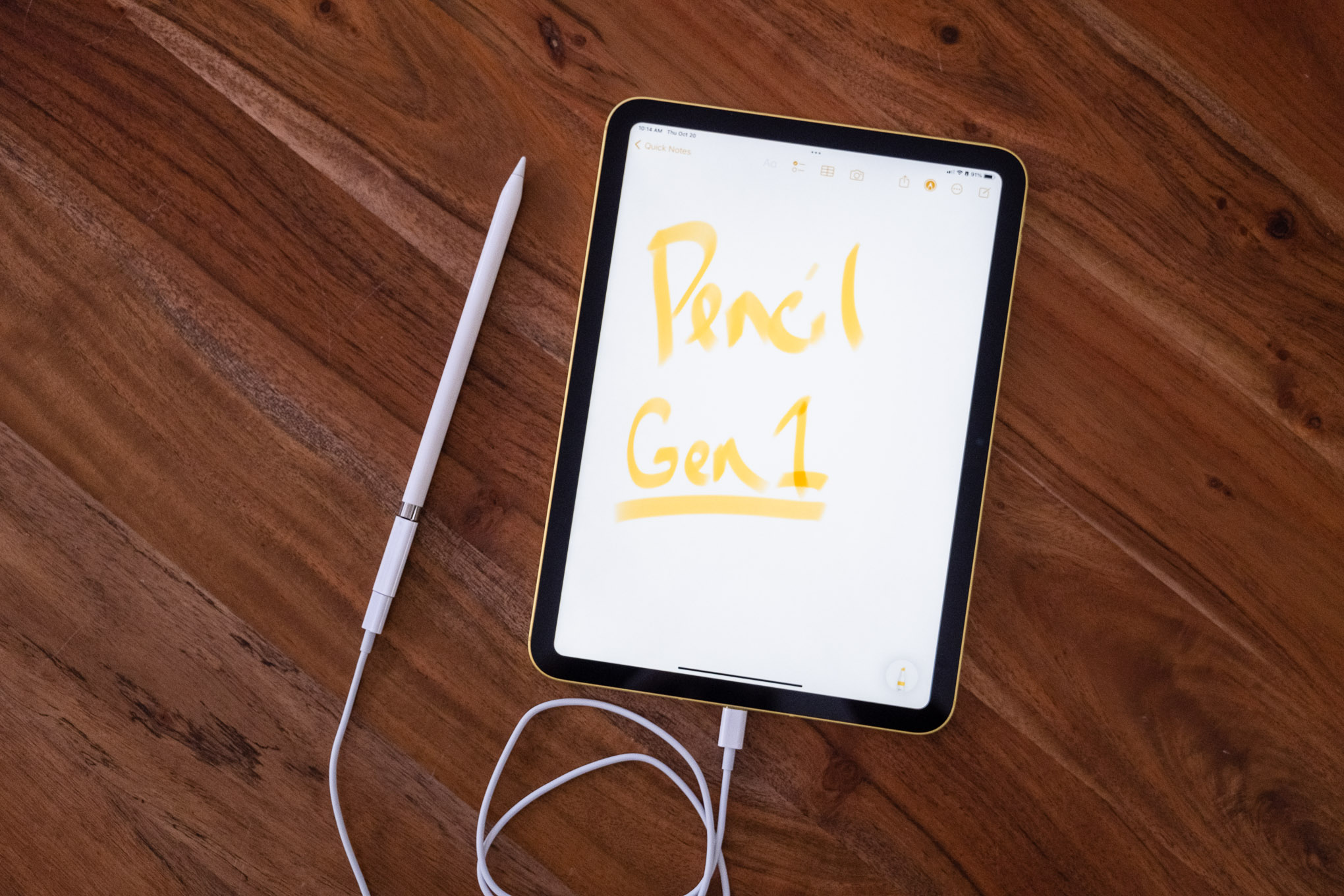
Pencil predicaments
Another confounding accessory situation is that the 10th-gen iPad doesn’t work
with the second-gen Apple Pencil, which has been shipping since 2018. It only works with the first-generation
model that came out way back in 2015. But since the new iPad doesn’t have a Lightning port anymore, pairing and
charging the $99 first-gen Pencil with this iPad requires a new $9 USB-C to Lightning adapter that plugs into a USB-C
cable that then plugs into the iPad itself. (Apple is bundling the adapter in the box with first-gen Pencils
purchased now, but if you’re upgrading from an older iPad and still want to use your Pencil with this one,
you’ll have to buy the adapter.)
Confusingly, the 10th-gen iPad is only compatible with the first-generation Apple Pencil, which
necessitates a comically awkward pairing and charging situation involving a USB-C cable and a new dongle
adapter.
So despite the new iPad having the same design as the iPad Air and Pro, complete with a flat side
that could be home to a second-gen Pencil, you’re stuck with a comical umbilical cord charging situation and
nowhere to store the Pencil when you’re not using it.
Those limitations with charging and storage were always weird with the first-gen Pencil but made more
sense when it was introduced as an add-on to an existing iPad design that wasn’t built to accommodate it. Apple
figured out a better iPad and Pencil solution back in 2018, and this iPad uses that better design, so
it’s baffling that we’re in this situation with a new iPad released in 2022.
So, yes, there’s an awkward charging situation and a silly little end cap that’s easy to lose. But
don’t worry, the first-gen Pencil is also worse to use than the second-gen model and doesn’t support things like
double-tap to switch between writing and erasing. Its glossy surface is also not as nice as the matte finish of
the newer model, and it has a much greater tendency to roll off a desk due to its circular design.
As for its performance, the first-gen ApplePencil is the same as the second-gen, and it has very
little lag and a smooth stroke. It’s pressure sensitive and has tilting support — both good for art and drawing
purposes — but I prefer Samsung and Microsoft’s softer-tipped styli for handwriting. The Pencil’s hard tip slips
and slides across the glass of the iPad and makes more noise when writing compared to the others.
For those who already have a first-gen Apple Pencil and are just looking to upgrade to this iPad,
it’s great that the older stylus is compatible with the new iPad. But Apple could have designed the iPad to work
with the second-gen Pencil and provided backward compatibility for the first-gen one for those that need it, and
it chose not to.
An Air on the inside
Inside, the 10th-gen iPad is a dead ringer for 2020’s fourth-gen iPad Air.
It’s got an A14 Bionic chip, Wi-Fi 6, and either 64GB or 256GB of storage. While the A14 is not as fast as the
M1 or M2 processors Apple’s putting into the more expensive iPads, I’d be shocked if most people can really
tell. This iPad has no problem doing the exact same tasks I use my 11-inch iPad Pro M1 for, from running
multiple apps side by side to jumping between tasks to playing games like Genshin Impact smoothly and
without issue.
Apple now has four different processors (five if you count the still-available ninth-gen iPad) in its
lineup of iPads, but outside of the most demanding uses, all the iPads I’ve used perform effectively the same.
If you’re coming to this iPad from a model that’s considerably older, you will certainly notice a faster
experience using it. But you’ll also get a faster experience from the $329 A13-powered ninth-gen iPad and save
$120.
The 10th-gen iPad remains very good at doing tablet things, like reading, watching movies,
playing games, light email, and simple productivity tasks.
Consistently, what’s struck me the most in the time I’ve been using this iPad is just how similar it
is to every other modern iPad once you look past its lower-quality screen. There really wasn’t anything I
couldn’t or found frustrating to do on this iPad that I’m accustomed to doing on the iPad Air or an 11-inch iPad
Pro. That’s a different experience than I have with MacBooks, where I can notice the difference in performance
between a MacBook Air and a MacBook Pro.
Battery life on this iPad is right in line with what we’ve come to expect from every iPad released
over the last decade or so — it will last about 10 hours or more for basic tasks, closer to six or seven if you
try to use it for office productivity work. The 10th-gen iPad also has optional sub-6GHz 5G support, making it
useful when you don’t have Wi-Fi available, but that’s a $150 upcharge, and at that price, you might as well
just consider an iPad Air.
iPadOS 16
The iPad runs iPadOS 16, which isn’t a huge departure from the last couple of
versions of iPadOS. It’s got a lot of the features that arrived on the iPhone in iOS 16, including editable
iMessages, live text for video, and the ability to pull a subject out of a picture and place them into another
app. It also has more options for adjusting the way apps are arranged in split-screen mode, as well as more
configurability for toolbar layouts in apps.
What’s missing in iPadOS 16 on this model compared to the Air or Pro is the Stage Manager windowing
feature and the ability to adjust the display scaling to show more things on the screen at a smaller size. At
least lacking Stage Manager isn’t a loss — it’s not a great experience in its current state — and unless you’re
coming to the new iPad from an Air or a Pro and are used to the scaling option, you’re not likely to miss that,
either.
iPadOS remains very straightforward and easy to use for tablet tasks, such as reading, light email,
watching movies, or playing games. It can also handle light workloads — I wrote much of this review on the iPad
in Google Docs in the Safari browser — but it still struggles with multitasking and heavier workloads compared
to a laptop. The 10.9-inch screen quickly gets cramped when working with longer documents and multiple apps, as
well. I don’t think many people are actually replacing their laptop with an iPad at this level, and if they are,
they are likely light users and aren’t hamstrung by iPadOS’s limitations.
I have seen some odd graphical and display bugs here and there, though, which tarnishes the polish
that we’ve come to expect from Apple’s platforms. Given that iPadOS 16 is actually launching as iPadOS 16.1, I’d
have expected these bugs to be ironed out, but it’s clear Apple still has some work to do.
Oh, and I feel like I’m beating a dead horse here, but I still think Apple should add multi-user
support to iPadOS, even though with each passing year, it seems less likely to happen. Entry-level iPads are
often shared devices in homes, as opposed to the iPad Pro, which is likely purchased for use by one person. Not
being able to support more than one user account at a time makes for a lousy experience when sharing an iPad.
The most basic Android tablets can support multiple users, complete with parent and children accounts — it’s
long past time Apple did as well.
iPadOS 16 on the 10th-gen iPad doesn’t have Stage Manager, which you can get on the Air and
Pro models, but it’s not a huge loss.
In a vacuum, there’s very little to complain about with the 10th-gen iPad.
It’s an excellent tablet that does all of the things you expect from a tablet very well. Even though its screen
isn’t as good as other iPads, it’s still good enough, and its performance is unimpeachable. If this was the only
iPad Apple sold, many people would buy it and be perfectly happy with it.
But in context with the many other iPads that Apple sells, I’m not sure why you’d pick this one. If
cost is a factor, you’re buying an iPad for a kid, or need a headphone jack, the still-available and much less
expensive ninth-gen model is the one to go with. For a lot of people, the ninth-gen model is the better iPad for
their needs. If you want the bigger screen and more modern design, the iPad Air is right there with its better
display, even faster processor, and better accessory landscape, and you can frequently get it for less than $100
more than the new iPad.
It’s likely that this iPad will be the entry-level iPad at some point, fully
replacing the ninth-gen model. But I hope that Apple brings the price down quite a bit by the time that happens
and adds the headphone jack back (which is, admittedly, unlikely to happen). Until then, the 10th-gen iPad sits
as a weird sub-midrange, not really budget-level middle child in Apple’s sprawling iPad lineup.
Today,
Apple published a press release announcing an update to the Apple TV
4K, which now comes in two configurations that offer different storage capacities and network connectivity. The
Apple TV HD is no longer available on Apple’s online store.
Source: Apple
The Apple TV 4K has been updated with an A15 Bionic chip and support for HDR10+, which is part of tvOS
16. The base configuration, which is $129, has 64GB of storage and is WiFi-only. The other model adds Gigabit
Ethernet and has 128GB of storage for $149. The top-tier Apple TV 4K supports Thread, which allows it to serve
as a smart home hub for Matter devices too.
CPU performance is now up to 50 percent faster than the previous generation, delivering greater
responsiveness, faster navigation, and snappier UI animations. GPU performance is now up to 30 percent
faster than the previous generation for even smoother gameplay.
The Siri Remote now charges via USB-C.
The Siri Remote now charges via USB-C.
The Siri Remote has remained mostly the same, except it has added USB-C charging in place of the previous
model’s Lightning port. The Siri Remote is included with the Apple TV but can be purchased separately for
$59.
Overall, the changes to the Apple TV 4K are fairly minor, notwithstanding the snappier UI the A15 Bionic
enables. I don’t see a good reason for most people to upgrade from a previous generation Apple TV 4K
unless you play a lot of games on the Apple TV and have run into storage limits. If you have an Apple TV HD
before and are planning on buying a 4K TV, the new model will save you some money and offer a few new perks.
Although it’s a shame that Ethernet is only available in the more expensive configuration, that’s
probably part of how the cost of the base model has been brought down, and I’m sure most people connect
their Apple TVs via WiFi anyway.
The new Apple TV 4K is available for pre-order now, with deliveries beginning on Friday, November 4th in
30 countries, including the US.
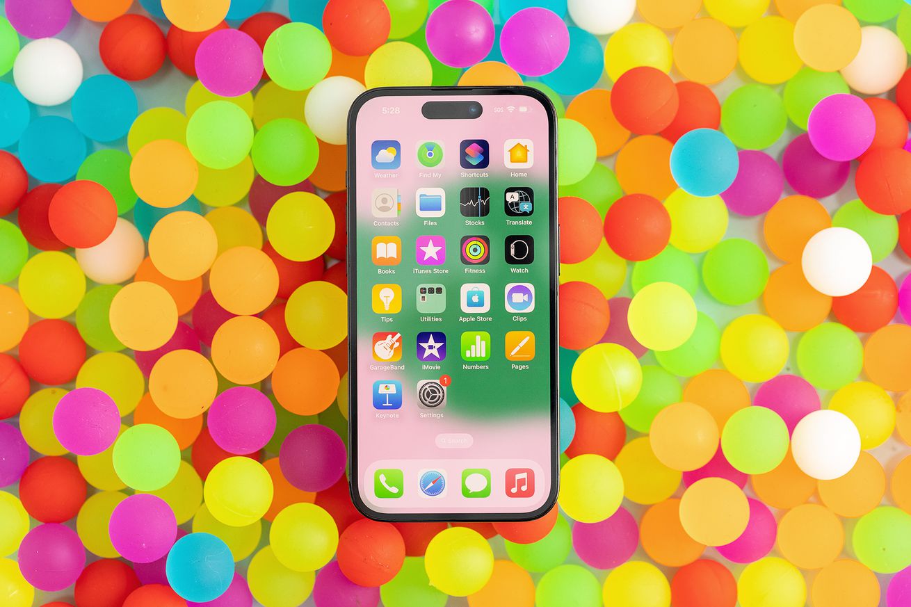
The best feature of the iPhone 14 is one that Apple didn’t tell
you about. Forget satellite SOS and the larger camera, the headline is this: Apple has completely redesigned
the internals of the iPhone 14 to make it easier to repair. It is not at all visible from the outside, but
this is a big deal. It’s the most significant design change to the iPhone in a long time. The iPhone 14 Pro and Pro Max models still have
the old architecture, so if you’re thinking about buying a new phone, and you want an iPhone that really
lasts—besides the one in your pocket—you
should keep reading.
If this surprises you, you’re not alone. It surprised us! The new features and external changes to the iPhone
14 are so slight that The Verge suggested it should have been called
the iPhone 13S, saying “The iPhone 13, which came out a year ago and Apple is still selling, is nearly
identical to the 14.”
But that’s actually not true—though almost nobody had any way of knowing. Apple didn’t mention
the secret redesign in their keynote. If reviewers had disassembled the phone, they would have discovered
this: The iPhone 14 opens from the front andthe back.
This is the iPhone 14 reborn as a beautiful butterfly—a midframe in the middle, accessible screen on the
left, and removable rear glass on the right.
That’s no small feat. The new metal midframe that supports the structure required an entire internal
redesign, as well as an RF rethink and an effective doubling of their ingress protection perimeter. In other
words, Apple has gone back to the drawing board and reworked the iPhone’s internals to make repair easier.
It’s an upgrade so seamless that the best tech reviewers in the world didn’t notice.
A Brief History of Phones
We’ve written thousands of repair guides for smartphones,
so before we dive into the details of the 14, let’s take a bird’s-eye view at the mechanical evolution of
smartphones. The iPhone has gone through a few major architectural shifts over the years.
The original phones opened screen first, making screen swaps on the 3G a
breeze. But getting at other parts, like the charge port and battery, was a lot harder.
Orange cables and blue boards—back in the days before Apple
dressed up their internals for us.
To solve that Apple flip-flopped their approach with iPhone 4, making the phone open back first. That allowed
for all kinds of cool aftermarket options like our transparent rear panel (I
still think this is pretty badass), but unfortunately made screen swaps a total pain. Apple pivoted back to
a (more streamlined) front-entry for the 5, and has stuck with it ever since. Opening the phone screen-first
made screen repairs vastly easier, and has generally worked out pretty well, save for one major
drawback—we’ll get to that in a minute.
Replacing the iPhone 4’s glass rear panel was a breeze.
That design is in marked contrast
to the rest of the phone industry. Almost every Android phone opens from the back. Ever since the Galaxy S6, the iPhone’s nemesis has had a glued on back panel.
Any repair tech will tell you that screen
swaps on the Galaxy are much harder than screen swaps on the iPhone. You have to unglue the back
panel, and then systematically work your way all the way through the phone removing components. Once the
whole thing is essentially de-manufactured, you’re left with the screen assembly. Then you have to put
together your entire phone! It’s quite a process, considering screens are the most common component to
repair.
Motorola or Samsung, you’re in for a lengthy pry session to
remove one of the least critical components.
The iPhone 8 Ushered in an Era of Pain
From our perspective, the iPhone’s design has optimized fast Apple store service of two critical components:
the screen and the battery. The disadvantage with this front-optimized design, of course, is that it’s hard
to swap out the back panel. That wasn’t really an issue until the iPhone 8, when they switched to
radio-transparent glass to support wireless charging and NFC payments. Then, with the X, they welded a bulky
camera lens cover over that glass.
If replacing the screen on a Galaxy phone is hard, changing the back glass
on an iPhone X (or 11, or 12, or 13) is murder. The easy part is removing every single component
from the phone. Seriously, you don’t want to leave any parts in there because the process is pretty rough on
the hardware. The adhesive holding the back glass down is so powerful that none of our usual techniques of
prying, heat, or chemicals budge it. Repair shops deploy a variety of aggressive shattering and scraping
techniques to remove the glass while carefully working around the welded camera bezels. The
“easiest” way uses a laser to systematically raster-vaporize the adhesive before then shattering and
scraping the glass shards off with razor blades and cutting tools. At the very least, heavy duty gloves are
required equipment if you don’t want to slice your hands open. Resultantly, this is not really a viable
process for DIYers. I’ve never done it, and hope I never have to.
A Bold New Approach: 14th Time’s the Charm
Enter the iPhone 14. The back glass is simply secured with two screws and a single connector. Apple has
seemingly used a slightly less aggressive adhesive, making opening it up a tad easier than screens of yore.
And as a bonus, removing the exact same screws as the back glass gets you access to the screen.
Just two screws, and both screen and back glass are immediately accessible. Incredible.
This back glass seam is enough to make teardown techs weep with
joy.
This is a dramatic rethinking of the phone, and the new approach impacts most aspects of the design. Adding a
whole new opening surface introduces a world of engineering challenges. There’s twice as much perimeter to
seal against water, lots of radio frequency complications, and a whole world of parts changes.
Any time you glue or weld something together, it’s easier to achieve thinness and durability targets. We’ve
long said that designers could get all of the design features and functionality they’re looking for, as well
as repairability, if they just put in a little more effort to avoid the glue. Well this time, Apple put in
the effort.
There’s a new midframe behind the screen that all the internal components are mounted onto. The incredible
wealth of antennas that make modern 5G + GPS + Wifi + Bluetooth + satellite signaling all work in one device
require extensive grounding. Ten new electromagnetic interference fingers connect to contact points spaced
across the rear panel to preserve grounding that was previously accomplished with welds.
Achieving the high levels of durability that we all expect is an incredible engineering challenge. When you
drop an iPhone 13, its metal frame absorbs that shock, transmitting and spreading the force across the
glued-in battery and sturdily adhered rear glass. The iPhone 14 meets this same challenge, but achieves the
required torsional rigidity in a totally different way. A new midframe sits between the display and the guts
of the phone and takes the brunt of force distribution across the frame and battery.
Another design challenge is the number of components that are integrated into the display assembly.
Historically, these have included the Face ID sensor, the speaker, and the ambient light sensor. We noticed
in the 13 Pro that Apple had
relocated the earpiece speaker and front-facing camera
from the display to the mainframe. At the time, we appreciated the move as incrementally increased
modularity, but we didn’t quite understand the rationale. Now it appears it laid the groundwork for a vastly
improved design.
A Few New Features
The advertised flagship features of the iPhone 14 are satellite-powered SOS, an upgraded camera, and a
missing SIM card slot. We’ll dive into more detail with our iPhone 14 Pro Max teardown, but here are some board shots while you
wait.
Apple’s pursuit of density is unparalleled. The iPhone 14 Pro Max logic board features the A16 processor,
which is an incremental 10-15% performance advancement over the 14’s A15.
The interior of the US Pro Max logic board features the communications chips and the large SIM reader gap.
One sneak peek ahead of time: we can confirm that the satellite connectivity is powered by a new Qualcomm
X65 modem, which adds new 2.4 GHz n53 band
capabilities to support Globalstar. ICJay Monroe, Globalstar’s Executive Chairman, bragged about this in a press
release earlier this year: “We have appreciated a close relationship with Qualcomm since the
inception of the company and want to thank the team there for their hard work in helping us deliver on Band
n53’s promise.”
Parts Pairing
Some iPhone procedures require ‘System Configuration,’ Apple’s favorite repair hurdle and
remote part activation tool.
We are hearing reports that Apple is continuing their hostile path of pairing parts to the phone, requiring
activation of the back glass after installation. You really shouldn’t need Apple’s permission to install a
sheet of glass on a phone that you already own.
Using software to prevent the use of aftermarket parts gets a big thumbs down from us. These locks are
frustrating and ultimately futile—Apple simply can’t control all the repairs that happen with their
products, no matter how hard they try. We’ll be reporting on parts compatibility a bit more after we finish
our lab tests, unless Apple miraculously posts their service manuals.
The Bottom Line
This is the most substantial iPhone redesign since the X. It’s hard to overstate how big a change this is.
For a reference point, Samsung hasn’t changed their phone architecture since 2015.
So, with the biggest update in years, we’re upgrading the iPhone 14 to a repairability score of 7 out of 10.
That’s the best score we’ve given an iPhone
since the iPhone 7. This is the most repairable iPhone in years.
This is such a big deal that it should have been Apple’s big announcement—the iPhone has been redesigned from
the inside out to make it easier to repair. In fact, just days before we started this teardown,
iFixit’s very own Sam
Goldheart argued that in this day and age, a product launch shouldn’t just rattle off tiny new
features. Why isn’t Tim Cook bragging about repairability? We had no idea this was coming, because Apple
didn’t mention it—at all. But they should have.
This design improvement is a big win. These changes to the iPhone will help it last longer and reduce its overall
impact on the planet. With any luck, it will inspire other manufacturers to follow suit.
All of our—and your—work has paid off. Our advocating, lobbying, yelling in the streets. We’ve convinced
Apple’s design team that repairability matters. Now we need your help to convince their marketing team to
talk about it when they take the biggest stage in tech.
If you’re trying to decide whether to go with the 14 or the Pro or Pro Max, from a repairability
perspective the answer is clear: It’s the 14 all the way. Let’s hope this advanced design becomes the
standard across the iPhone 15 lineup. In the mean time, the greenest phone is the one you’ve already got, so
join us in skipping the upgrade, we’ve got
the refresh you need at the price you’ll like.
Want your phone to look like this, but without the heating and prying? We’ve got you. iPhone 14 Teardown wallpapers
are live—and free! The backgrounds for the 14 Pro will be available soon, for now, check out the iPhone 14 Pro Max teardown to get a
preview.
A Connecticut jury has ordered Infowars host Alex Jones
to
pay $964.2 million for defaming the families of eight mass shooting victims and an FBI agent in his second
penalty this year. The decision came after a tumultuous trial that saw Jones declare
he was
“done saying I’m sorry” for spreading false claims about the 2012 mass shooting at Sandy Hook Elementary
School. The damages are split between 15 plaintiffs and range between $120 million and $28.8 million apiece.
Jones was sued for defamation by a group of families who had relatives killed at Sandy Hook. As
with a previous case in Jones’ home state of Texas, Jones lost the case by default for refusing to
cooperate, so the trial determined the damages he owed. A third trial is set to begin in Texas late this
year.
During testimony, family members described enduring years of harassment after Infowars repeatedly
aired stories claiming the families were actors recruited to help fake the shooting. “It was almost like I
knew when Alex Jones said something, because we would get a huge wave of stuff,” said
Robbie Parker
, whose daughter Emilie was killed at Sandy Hook. Jones has since said he believes the
attack was real — but, the families’ lawyers argued, only after making millions of dollars profiting from
lies about it.
Jones drew repeated condemnations from Judge Barbara Bellis during the trial, including threats
to hold him in contempt of court. Among other things, he held an unsanctioned press conference outside the
courthouse, potentially within hearing range of jurors who had been instructed not to seek information about
the case outside the courtroom. He indicated he would appeal after the verdict,
according to Vice
reporter
Anna Merlan.
Unlike an earlier case in Texas — where a jury handed down a
$45.2 million fine
that will likely be reduced — Connecticut does not limit the damages in
defamation cases, which will create a substantial burden for Jones. Infowars parent company Free Speech
Systems filed for bankruptcy ahead of the trial, a move families say was meant to shield millions of dollars
from the court system.
Snapchat
is rolling out a new AR experience that lets you try on and purchase Halloween costumes directly within its
app, the company announced today. Starting today, Snapchat users can try on and buy costumes of popular
movie and TV characters from Stranger Things, Harry Potter, Squid Game, Minecraft, Ghostbusters and more.
The new AR experience is launching in partnership with costume company Disguise.
You can try out the new experience by typing “Disguise costumes” in the app’s search bar to
browse through Snap’s Halloween costumes. Or, you can search for specific costumes by searching for
specific movies or TV shows, such as Squid Game or Stranger things, through the Lens Explorer. Then,
you’ll need to take a few full-body photos in whatever you’re wearing, and Snap’s AR
technology will then apply the costume onto your photo. You can then save the picture or send it to your
friends. If you like the costume, you can purchase it directly within the app. Purchases will be made
through Disguise Costumes.
Image Credits: Snap
The launch comes as Snap recently expanded
its investment in AR shopping with the introduction of tools that turn retailers’ photos into 3D assets and
the launch of an in-app destination for AR fashion and virtual try-on called “Dress Up.” The company has
been making strides with AR-powered e-commerce over the past year, having given its computer vision-based “Scan”
feature a more prominent placement inside the Camera section of the app and upgrading it with
commerce capabilities.
Snap says that it conducted a study with consulting firm Ipsos and found that 92% of Gen Z users are
interested in using AR for shopping. It’s no surprise that AR is becoming more popular for shopping
purposes, as more and more companies are incorporating the technology into their retail efforts.
For instance, Amazon launched
a feature called Virtual Try-On for Shoes in June that allows customers to visualize how a pair of
new shoes will look on themselves from multiple angles using their mobile phone’s camera. In addition, Pinterest
and Google
have also leveraged AR to allow shoppers to try on makeup, apparel and accessories.
All hell breaks loose this evening after Tesla CEO Elon Musk proposed a “Russia-Ukraine Peace” plan that
angered the Ukrainian president, blue-check mark gatekeepers, journalists, government officials,
and NAFO members.
On Monday, Musk posted a tweet that offered the possibility of a peaceful resolution to bring an end to the
ongoing war between Russia and Ukraine to avoid World War III and avert a nuclear war.
In a poll titled, Ukraine-Russia Peace,” Musk asked over 100 million of his Twitter followers
to vote on whether they think it’s a good idea or not, to propose a “redo” elections of the four
annexed regions of eastern Ukraine which voted last week to be part of the Russian Federation. In addition,
Musk also said that the peace deal would also be conditioned on Ukraine remaining neutral and not becoming a
future member of NATO.
About an hour after the tweet went live, the majority of Musk fans voted Yes in favor of peace. But it didn’t
take long before Musk started to receive angry responses from pundits, politicians, government
officials, Blue-check mark gatekeepers, journalists, bots, pundits, and even bots.
Then a couple of hours after the poll went live, which by then showed almost 40% saying “yes” and just over
60% voting it down, Musk said it is being attacked by bots.
Musk’s proposed “Ukraine-Russia peace” plan also caught the attention of Ukrainian President Volodymyr
Zelensky. “Which Elon Musk Do You Like?” Zelensky sarcastically responds to Musk’s poll.
In a poll to his six million followers, Zelensky asked whether they would like Elon better if he “supports
Ukraine” or “supports Russia” – knowing fully well that Musk’s original tweet and poll did not show any
“support” for Russia.
Zelensky is not alone. Ukrainian diplomats among others, such as Kiev’s ambassador to Germany, also
lashed out at Musk… “Fuck off is my very diplomatic reply to you,” Ambassador Andrij Melnyk tweeted in
response to Musk’s poll.
It didn’t stop there as the pile-on continues. Within four hours, Musk received a trove load of hate mail and
responses accusing Musk of somehow being a pro-Kremlin stooge.
But Musk did not back down. He went on to warn about the potential outcome if a peace deal is not reached.
Responding to Renata Konkoly, Musk said: “You are assuming that I wish to be popular. I don’t
care. I do care that millions of people may die needlessly for an essentially identical outcome.”
“Russia is doing a partial mobilization. They go to full war mobilization if Crimea is in danger. Death
on both sides will be devastating. Russia has >3 times the population of Ukraine, so victory for
Ukraine is unlikely in an all-out war. If you care about the Ukrainian people, seek peace,” Musk added
It didn’t end there. US politicians also joined in mocking Musk. Congressman Adam Kinzinger said:
“This idea reminds me of fourth-grade social studies where we made a peace plan between the USSR and the
United States. We thought that if Gorbachev and Reagan were forced to eat an American dinner and a
Russian one, they would become friends .for real,” he tweeted.
Enlarge/ The (customized) lock
screen in iOS 16. (credit: Samuel Axon)
For the past couple of years, Apple’s annual iOS updates have laser focused on one feature for an
overhaul while making smaller tweaks to everything else. Last year, Focus was the, well, focus. The year
before that, it was the home screen.
This time it’s the lock screen. You can now change fonts, add widgets, customize the information
displayed, and pick from a wider variety of wallpaper. Apple has also more deeply integrated the lock
screen with the Focus modes that were fleshed
out in iOS 15. And it has laid the groundwork for something more than just notifications that
third-party apps can show you before you unlock your phone.
Given the increasingly iterative nature of iOS releases today—with many key features not arriving until
months after the initial ship date of a new, whole-numbered version—we’re moving to leaner initial iOS
reviews, with updates to come in additional articles over time. So today we’re going to look at the main
new feature of iOS 16, but we’ll touch on a couple of other key features and changes, too.
While iOS 16 touches most aspects of using the iPhone in a variety of small ways, it is very much “the
lock screen update.” That makes sense: Apple makes a lot of noise about shipping features that integrate
hardware and software, and the iPhone
14 Pro’s new always-on display drives this emphasis on the lock screen.
But there’s plenty here for users of other iPhone models that lack that always-on feature. Following up
last year’s emphasis on Focus modes, and the previous year’s on home
screen customization, this is the most significant move Apple has made on the customization
front with the iPhone in, well, pretty much ever.
I know what you’re going to say: aren’t these all features that have been part of Android for basically
an eternity now?
Yep, you’re right—mostly. In typical Apple fashion, there are some flourishes here that Android doesn’t
touch, but as for functionality, this is mostly yesterday’s news for Android diehards. But what was
already a win for Android users is largely a win for iOS users, too.
It’s easy to see the influence of the Apple Watch on this update—the new widgets behave like
complications, and the new lock screen acts like a Watch face. That sentence right there tells you just
about everything you need to know about the new lock screen. Picture the Apple Watch and all the
customizations, features, and limitations the Watch faces offer. Now make all that phone-sized. There
you go, that’s the new iOS lock screen.
This is the picker you get when you long-press on your lock screen. [credit:
Samuel Axon ]
To start playing with these customizations, you just long-press your finger on the lock screen. This
brings you to an interface with horizontally scrolling cards, each one representing one of your custom
screens.
At the bottom, there are three important buttons. You can tap “Focus” to change the Focus mode that turns
on when this lock screen is active. You can tap “customize” to change your widgets, fonts, wallpapers,
and more. And there’s a “+” button to add a new custom lock screen to the row of cards.
It starts with wallpapers
When you hit the + button, a panel pops up to offer you a variety of wallpaper possibilities. These
options fall into a few buckets. There are color gradient wallpapers, where you pick a general color
theme and define some attributes of a simple gradient. (It looks nicer than it sounds, actually.)
There are collections, which are a bit like Apple’s previous approach to iPhone wallpapers: premade
patterns in a few different color options.
You can also make a wallpaper out of emojis on a grid or in a pattern across the screen, and you can even
pick which emojis to display. You can choose up to six emojis to include in the wallpaper, using Apple’s
standard emoji-picking interface.
This is the wallpaper picker panel you get when you start creating a new lock screen.
[credit:
Samuel Axon ]
My personal favorite bucket for wallpapers is the “Weather & Astronomy” category. These provide
little in the way of customization, but they’re quite snazzy. The obvious one here changes the wallpaper
visuals to match the live weather conditions in your area—and said visuals look like the ones that
already paint the Weather app.
There are also dynamic wallpapers for the Earth, moon, and solar system. The solar system one shows the
actual current relative locations of the planets as they orbit the sun, while the Earth one shows your
location on a globe with a green dot, amidst live-updating cloud cover that reflects conditions around
the globe.
The moon and Earth ones animate to different angles as you move from the always-on display to an active
lock screen and then swipe for the home screen. It’s a fun effect, and the moon wallpaper in particular
looks amazing on OLED iPhone screens.
One variation of the Earth wallpaper. [credit:
Samuel Axon ]
But as neat as those are, I imagine most people will choose to go with the wallpapers that use photos
from your library in the Photos app. Tapping “Photos” gives you a choice between individual photos on
your phone.
Using machine learning, the iPhone analyzes all the photos in your library so you can be presented with
“Featured” suggestions, which I found to be mostly on the money. There are even subcategories for these
featured suggestions, including people, pets, nature, and cities. And of course, you can browse your
entire photo library and pick any image you’d like.
There’s also “Photo Shuffle,” which is “a dynamic set of photos that shuffle as you use your iPhone
throughout the day,” according to the tooltip. You can set the shuffle frequency to change on tap, on
lock, hourly, or daily. Once again, it presents you with featured photos, and it lets you pick which
categories to include—but you can still manually select each photo from your library.
This is the manual photo wallpaper picker, with recommendations and categories. [credit:
Samuel Axon ]
This is as good a place as any to note that for photo wallpapers, Apple uses some neat AI tricks to cut
out major objects in the image, like faces or buildings, and allows them to overlay bits of the time
indicator, creating a neat effect. It’s shocking how well this works, actually. Unfortunately, it
doesn’t work when you add widgets below the time. Except for that limitation, you can toggle this on and
off at will.
Once you’ve picked your wallpaper, you’re taken to the full lock screen customization view.
Customizing the lock screen
The screen you see when you customize a newly created lock screen is the same one you get when you tap
the “Customize” button on an existing lock screen.
Swiping along the screen swaps between different options for your chosen lock screen category, and what
that means varies by the category. For photos, it moves between different filters like “black &
white,” “natural,” and “duotone.” For the astronomy wallpapers, it cycles through different viewing
angles on the stellar bodies in question. And for emojis, it changes the grid size and pattern.
Beyond wallpapers, every lock screen has three distinct elements you can customize: the text field above
the clock, the clock itself, and a widgets dock below the clock.
The above-clock field can include text- and symbol-based information from Weather, Calendar, Clock,
Fitness, Reminders, Stocks, and any third-party apps that are supported. This is a good place for static
information that can be conveyed in a number or a couple of words.
This is the top-level customization interface you get when you add a new lock screen, or
customize an existing one. [credit:
Samuel Axon ]
Moving down to the clock, you can tap on it to bring up font and color options. There are eight font
options, but a few of them are quite similar to one another. Once you’ve settled on a font, you can also
pick a color from a horizontally scrolling list. iOS starts the list off with 14 suggested hues based on
the colors that it detects in the wallpaper you chose, and you can use a slider to adjust the saturation
of each. Alternatively, you can scroll all the way to the end of the list to use a proper color picker;
you’ll even find RGB sliders and a field for entering a hex value.
Each UI element (including widgets) follows a limited, monochrome visual language, so it all looks pretty
similar in practice, regardless of your customizations. The color picker for the clock also changes the
color of the text field above the clock and of the widgets below it.
Bizarrely, the color selection does not apply to the lock screen’s flashlight and camera
buttons, which still cannot be removed. I find it jarring to have these two non-removable, permanently
white elements on a screen that is otherwise uniform in another color scheme. I almost can’t believe
this was intentional, but there it is.
Finally, there’s the widgets dock.
The widgets are a start, at least
The rectangle-shaped widgets dock can hold up to four of the smallest, square-shaped widgets, or up to
two of the double-width rectangular options that offer more detailed information.
The picker for these resembles the one that already exists for adding widgets to the home screen.
Examples of included widgets are your Fitness rings, various pieces of weather information like
temperature, upcoming calendar events or reminders, stocks, and device battery trackers.
Unfortunately, Apple’s offerings of widgets for the home screen feel anemic. There are far fewer than
launched with the home screen’s widgets feature in iOS 14, and we noted back then that those
widgets were already anemic. The options Apple has provided for its preinstalled apps are as barebones
as it gets, so that leaves things up to third-party app developers.
But with iOS 16’s relatively rocky beta period and short-notice launch, the list of third-party apps that
offer great home screen widgets remains relatively small.
I have 387 apps installed on my personal iPhone, and only two of them offer any kind of lock screen
integration at this writing: Todoist and Snapchat. Your mileage may vary, of course, but I doubt it will
be significantly better.
The widgets apps list is very, very short. This is most of it, right in this small view.
[credit:
Samuel Axon ]
All that is to say that while Apple has provided a sturdy skeleton for home screen widgets (provided
you’re cool with little to no interactivity, of course), it’s all bones and no meat right now. But that
skeleton is so strong, and the demand is so high, I expect things will change soon.
The situation is likely to improve once the delayed Live
Activities API rolls out. Live Activities will allow apps to serve up much more detailed,
live-updating visuals and information outside of the widgets dock, in the middle or bottom of the
screen. Apple has used this to rebuild the lock screen music player, which shows album art and critical
controls during playback.
The API will be available to the wider developer community sometime before the end of the year, Apple
says. Some partners have already demonstrated what they plan to do with it; for example, Uber will show
a progress bar, pickup time estimates, driver name, car make and model, and license plate—all the stuff
you need to find your Uber when it arrives—on the lock screen with Live Activities. Previously, you had
to dig into the app to get this information.
But until the API rolls out, the lock screen still feels quite static, even though there are a few ways
to make it feel more your own.
Notifications have been redesigned
To make room for features like widgets and Live Activities, Apple has moved app notifications to the
bottom of the screen, where they roll in from below, one by one.
This follows Apple’s recent trend of moving a lot more UI stuff to the bottom, where you can
more easily reach it with your thumb on large phones. It wasn’t long ago that the company did the same
with Safari’s search bar.
Some people hate this trend, but with phones being the size they are now, I think most critical
intractable UI elements need to be at the bottom of the screen. Anything else is a legit usability
issue. So I welcome this change—and not just because it makes more room for widgets and other
customization in the middle of the lock screen.
There are also three different notification views on the lock screen, and you can choose your favorite in
the Notifications panel in the Settings app. The options include count, stack, and list. List simply
puts the rectangle-shaped notifications in a straightforward, top-to-bottom list. Stacks adds a depth
effect so the top one covers the top half of the second one (and so on) as they fade into the background
towards the bottom. And count just tells you how many notifications you have until you tap for more
details.
The default seems to be stacks, and that feels like the most sensible one to me. But count is good for
users who want a distraction-free lock screen, and the list view is most similar to older iPhone
notifications.
Nothing has changed about the behavior of notifications—they’ve just been moved and given a few different
presentation options in their updated location on the lock screen.
Focus
Focus was the big feature last year, so it makes sense that there are refinements and additions in the
next major update—especially since the lock screen has been designed to work closely with Focus.
When you’re looking at your lock screen, a long press followed by a quick swipe to the left or right
swaps between your previously created lock screens. Since each lock screen can automatically be
associated with a Focus mode, this is a more elegant way to switch modes than the old method of digging
into the Control Center. (Though you can still do that, of course.)
You can link a specific Focus to a specific lock screen in the lock screen customization
menu. [credit:
Samuel Axon ]
If you have an Apple Watch, you can also sync your Watch face with your Focus, so in a way, swiping
between home screens is now the baseline for adjusting the behavior of your entire mobile Apple software
experience.
There are some other interesting changes to Focus beyond the tie-in with lock screens. Setting up a Focus
is a lot easier now because you can block apps or contacts within a blocklist rather than an allowlist.
Previously, you had to manually add each app or contact you wanted to receive notifications from when a
Focus was active. Obviously, that wasn’t always optimal, depending on how many you wanted to add. Now
you can pick which way to go at it, which is a helpful change.
Apple has tweaked the Focus setup experience in various ways beyond that, making it a bit more
streamlined. And when you’re setting up a Focus, you’ll receive suggestions for what to include in your
lock screen or home page for that Focus.
Focus filters
There’s one major new Focus feature that’s not associated with the lock screen: Focus filters.
Previously, Focus chiefly affected notification behaviors and your home screen layout. But now you can
define some different behaviors within apps like Mail or Safari, too. For example, you can see only
emails from your personal email account when you’re in an after-work Focus mode, or you can define which
Safari tap groups show up in different Focus modes.
As with the lock screen widgets, the available applications for this are limited at launch. But Apple is
releasing a Focus filter API for developers, so if third-party apps go all in, it will be a big deal for
Focus.
When Apple first launched Focus last year, I thought it was neat (and I do use Focus in my day-to-day
life) but limited. The idea of Focus digging into apps themselves greatly expands the appeal and
practicality of the concept, and I’m excited to see where this goes, even though the current offering is
small in scope.
Beyond the lock screen
While the lock screen and associated notifications and Focus changes are the big story for iOS 16, Apple
has made smaller changes throughout the OS and its various pre-installed apps. We won’t get into every
one of those here (if you want a list, Apple has published a thorough one), but I’ll cherry pick a few I
think are particularly worth noting before we wrap up.
Mail and Messages
In both Messages and Mail, you can now undo sent messages. In Messages, you have up to two minutes, but
this only works if the person on the other end is using iOS 16. Users on Android or older versions of
iOS receive the messages normally. And even if you do unsend a message that went to an iOS 16 recipient,
they’ll still see that you unsent something; they just won’t see what it was.
In Mail, you have up to ten seconds by default. You can increase the time to 20 or 30 seconds within the
Mail panel in the Settings app. You can also disable this feature entirely.
In Messages, you can also edit a message up to 15 minutes after you first sent it. Again, recipients have
to be using iOS 16. In this case, recipients can see a record of your edits.
In Mail, search has been improved in several small ways, you can add rich links to emails, and you can
schedule emails to be sent at a later time. You can also swipe on emails to set a follow-up reminder for
any date or time from that email. It’s still not as robust as the “snooze” option found in many Inbox
Zero-oriented email apps, and I really wish Apple would just do that already.
Maps and transit
Apple Maps, once the rightful butt of jokes for its drastic inferiority to Google Maps, has really come
into its own over the years. At one time, I would never have considered switching, but I’ve been almost
exclusively using Apple Maps for the past two years and haven’t looked back.
That said, there was one feature whose absence continued to baffle me: multi-stop directions. In Google
Maps, you can plot a route that hits multiple points along the way. Now you can in Apple Maps too, at
least for driving directions. So if you’re planning a whole set of errands instead of just going from
point A to point B, it’s a lot easier now.
Multi-step directions are now possible in Maps. Finally! [credit:
Samuel Axon ]
The lone feature from Google Maps that I still personally miss is the hour-by-hour live updates on how
busy locations like bars and restaurants are. Add that, Apple, and I’ll never open Google Maps again.
There are also some improvements to transit directions, and you can check transit fares and add funds to
your transit cards directly from Maps.
Safari and passkeys
iOS 15 was a big one for Safari, but iOS 16? Not so much. There are some minor improvements to tabs and
tab groups, including the ability to pin tabs. Extensions and website settings can sync between devices.
The most notable new Safari feature is passkeys, which is also coming to some supported iOS apps.
Passkeys allow you to log in to websites or app accounts using just Face ID or Touch ID, without
creating, tracking, or remembering passwords. The concept is based on the FIDO standard, developed in an
industry-spanning partnership between Apple, Google, and Microsoft. It’s meant to replace passwords
outright with a digital signature that exists locally on your device (but that can be synced via the
cloud). This signature can only be accessed with the method you use to log into your device itself—in
this case, Face ID or Touch ID.
We’ve
written about the thought process behind FIDO and passkeys before. The iOS 16-specific story
here is that iOS 16 is one of the first major attempts to implement this feature at a large scale, but
like so many other big iOS 16 features (lock screen widgets, the iPhone 14 Pro’s Dynamic Island, the
Focus API, Live Activities, and so on) its appeal is highly dependent on developer adoption.
That’s minimal so far, but with such broad backing from big tech and such a strong value proposition, I’m
expecting passkeys to grow long legs in the coming months and years.
A few other notables
Here’s a quick grab bag of some other changes I particularly liked:
The numeric/percentage battery indicator has returned! It’s not on by default, but you can turn it
on in Settings. It replaces the vague and (for me at least) anxiety-inducing graphic battery
indicator with a static battery graphic with a number overlay. I really like it.
You can use the same tech Apple uses to overlay people, pets, et cetera on the clock in the home
screen—but on your own photos within the Photo app, plucking subjects out of the scene. Neat!
There’s a new, tappable Spotlight search field at the bottom of the home screen, just above the
dock. I don’t understand why this would be desirable, since you could always just swipe down on the
home screen to use Spotlight. Fortunately, you can turn it off in Settings.
You can turn on Android-style haptic feedback for keyboard typing. It feels good and long overdue. I
turned it on and plan to stick with it.
There are a number of new family management features, including the ability to approve kids’ Screen
Time requests via Messages and a new device setup process for kids’ devices.
There’s a new Safety Check feature for victims of domestic violence.
Face ID now works in landscape mode.
It’s the little things, really
It’s a challenge to review iOS 16, because some of the biggest features like the Live Activities API or
iCloud Shared Photo Library didn’t make the initial release and are planned for updates later this year.
And many of the changes that did come at launch are dependent on third-party developer support to become
truly useful.
But most of what Apple previously announced for the lock screen, at least, is here. And fortunately, that
means the biggest expansion of user customization for the iPhone since it launched. And Apple’s
pre-built wallpaper solutions are very cool.
We didn’t have any serious problems with iOS 16. Despite a somewhat rocky beta period, iOS 16 seems much
lighter on notable annoyances or bugs than some other recent annual updates. For that, we’re grateful.
iOS 16 won’t completely change the way you use your iPhone, but it’s full of welcome tweaks and new
customization options. While this could be described as “the lock screen update,” it has enough small
things going on to make it worth installing.
The good
Lock screen features bring more customization to the iPhone than it’s ever had
Focus looks to finally become truly useful with in-app integrations
Small updates like landscape Face ID, keyboard haptics, and the return of battery percentage add up
Apple’s continued emphasis on safety, security, and accessibility features continues to impress
The bad
Lock screen widgets are anemic at launch, so they feel more like set dressing than something useful
The appeal of most of the important features depends on third-party dev support that hasn’t fully
arrived
Several key iOS 16 features didn’t make launch, like family photo libraries and the Live Activities
API
The ugly
Nothing, really—at least nothing new in this update
The City of London police report
they’ve arrested a 17-year-old in Oxfordshire on suspicion of hacking and said he remains in custody,
without releasing any other details.
Police declined to say what incident the arrest was in connection with, but many of the details line up with
recent high-profile hacks. This spring, the City of London police arrested
and released seven teenagers in connection with an investigation into the Lapsus$ hacking group.
Today’s arrest also comes just days after two security breaches believed to be connected to Lapsus$, with
the leak of early Grand Theft
Auto 6 footage due to a “network intrusion” and a
security breach at Uber that caused it to take several internal systems offline for a while.
On the evening of Thursday 22 September 2022, the City of London Police arrested
a 17-year-old in Oxfordshire on suspicion of hacking, as part of an investigation supported by the @NCA_UK’s National Cyber Crime Unit
(NCCU).
In March, Bloomberg
reported that a person believed to be behind several of the group’s major attacks was a
then-16-year-old whose home the police visited near Oxford, England, which is in the county of Oxfordshire.
In a statement after the Uber
breach, the company wrote on its blog, “We believe that this attacker
(or attackers) are affiliated with a hacking group called Lapsus$, which has been increasingly active over
the last year or so.” The GTA 6 leaker claimed in forum posts to be the same person responsible for
the attack on Uber.
City of London police declined to share additional details with The Verge.
Are you looking for a fun, boho-inspired addition to your child’s room? Then macrame baby swing is a must-have. It’s perfect for those lazy summer days when you want to relax and watch your little one play.
Macrame baby swings are becoming increasingly popular, and it’s no wonder why. They add a touch of whimsy and charm to any room. Macrame baby swings are similar to hammocks, but they’re smaller and have a more delicate design.
Whether you want to buy a macrame baby swing or do it yourself, we’ve got you covered. This article will show you how to make your own macrame baby swing and where to buy one if you’re not up for the DIY challenge.
What Is Macrame?
Macrame is a form of textile-making that uses knotting techniques to create intricate patterns. It first became popular in the 1970s but has seen a resurgence in recent years due to the bohemian/boho-chic trend.
While macrame can be used to create a wide variety of items, It’s often used to make wall hangings, plant hangers, and other home decor items.
Is A Macrame Baby Swing Safe?
Yes, macrame baby swings are safe. They’re made out of lightweight materials and have sturdy construction. However, it’s important to make sure that the swing is hung securely and that there’s nothing nearby that your child could bump into while playing.
A lot of time macrame baby swings come with wooden elements like a bar or hoop. These can add extra stability and security to the swing.
Where To Put The Macrame Baby Swing?
Macrame baby swings can be hung indoors or outdoors. They look great in a child’s bedroom, playroom, or even living room. If you’re planning on using it outdoors, choose a shady spot out of the way of any potential hazards.
As with any piece of baby gear, there are some safety considerations to keep in mind when using a macrame baby swing.
Always use the swing indoors or in a shady, well-ventilated area outdoors. The swing should never be left in direct sunlight.
Make sure the swing is on a level surface before letting your child use it. The last thing you want is for the swing to tip over while your child is in it.
Never leave your child unattended in the swing. Always stay within arms’ reach if your child needs help getting out or falls asleep in the swing.
Inspect the swing regularly for any signs of wear and tear. If you see any fraying or damage to the rope, discontinue the use of the swing and replace the damaged parts.
By following these simple safety tips, you can ensure your child has a safe and enjoyable experience in their macrame baby swing.
Best Ready-To-Buy Macrame Baby Swings
If you’re not up for the challenge of making your own macrame baby swing, then there are plenty of options available to purchase. Here are some of our favorites!
This macrame baby swing is handmade in India using 100% cotton rope. It’s durable and perfect for indoor or outdoor use. Perfect for toddlers up to 50 lbs.
This macrame baby swing is made out of durable materials. It has a safety belt to keep your child secure and can hold up to 110 lbs. Perfect for use outdoors.
A high-quality, handmade cotton Macrame baby swing composed of solid wood and knitted by hand, offering excellent safety and quality. The baby swing includes a 39-inch chain and a non-slip children’s seat cushion, which is both comfortable and supportive for your little one.
The swing may be raised or lowered as required to ensure that the infant is more comfortable. The swing can bear up to 80 pounds, and it is designed for children aged 1-5.
The Bean Sprout Baby Hammock Swing Chair is the perfect place for your little one to relax. It is a premium quality macrame baby swing made of 100% cotton. It is soft, comfortable, and safe for your baby.
Choosing A Macrame Baby Swing
When choosing a macrame baby swing, there are a few things to keep in mind. First, consider the size of the swing. It should be big enough for your baby to comfortably sit or lie down in but not so large that it takes up too much space in the room.
Second, think about the design. There are many different macrame patterns to choose from. Some are more intricate than others. Consider the overall style of your home and choose a swing that fits in with the rest of your decor.
Last, think about functionality. Some swings come with additional features like a wooden bar or hoop. These can add stability and security to the swing. Others come with removable cushions for added comfort. Choose the features that are most important to you and your family.
How To Make Macrame Baby Swing Yourself
Making your own macrame baby swing is excellent if you’re feeling crafty and up for the challenge. You will save money, but you’ll also get to choose the perfect design and color scheme for your home.
The Internet is full of different tutorials on making a macrame baby swing. We recommend you check out this step-by-step guide:
What Do You Need To Make A Macrame Baby Swing?
Macrame cord
Wooden dowel or hoop
Wooden base
Scissors
Tape measure
Pencil or pen
Paper clips
Choosing the suitable macrame cord/rope is crucial in making your own macrame baby swing. The cord should be strong enough to support your child’s weight but also soft and comfortable to the touch.
We recommend using a 3/8-inch (9mm) cotton rope. This size is strong enough to support most babies and toddlers, but it’s also soft and gentle on the skin.
Other popular macrame cords are made of jute or hemp. These materials are also strong and durable, but they’re not as soft as cotton. If you choose to use one of these materials, add a cushion or padding to the swing, so your child is comfortable.
When searching for a macrame baby swing pattern or tutorial, double-check a list of supplies needed. Some designs call for special tools or equipment that you may not have around the house.
We also recommend reading through the entire pattern before starting. This will help you understand the steps involved and ensure you have everything you need.
How Much Macrame Cord Do I Need For A Swing?
The amount of cord you need will depend on the size of the swing and the design you choose. Most macrame baby swing patterns call for between 50 and 100 feet (15 to 30 meters) of macrame cord.
We recommend purchasing at least 200 feet (60 meters) of cord to be safe. This will give you enough to make a baby swing and allow some mistakes along the way. You can always use the extra cord for another project or donate it to a local craft store.
What Size Rope Is Best For A Baby Swing?
The most popular macrame cord size for a baby swing is 3/8-inch (9mm). This size is strong enough to support most babies and toddlers, but it can vary depending on a particular project.
Why Make A Macrame Baby Swing?
A macrame baby swing is a beautiful and unique addition to your child’s nursery or playroom. Not only is it eye-catching, but it’s also sturdy and functional.
As your child grows, they’ll be able to enjoy the swing as a fun place to play or relax. And when they’re no longer using it, you can easily repurpose it into a wall hanging or other home decor item.
If you decide to make a macrame baby swing yourself, it’s a great way to add a personal touch to your child’s room. Plus, there is something very satisfying about creating something beautiful with your own two hands. Your baby will be able to enjoy the swing for years to come, and it will always hold sentimental value.


